Back

Redesign Detail Product Page Ratakan

UI/UX Designer
1.5 Weeks
B2C Website Design
Redesign Detail Product Page Ratakan
UI/UX Designer
1.5 Weeks
B2C Website
Intro

Overview

Overview
This project is one of the results I obtained during an internship in 2022. In this project, I aimed to redesign detail product page to improve consistency design and turned user activities into sales

Approach

Approach
My mainly was focus on redesigning detail product page and cart page, brainstorm and explore layout plus component itself

Constraint

Constraint
I got brief from my mentor to do redesign detail product page plus cart page, The deadline was tight because i only had 1.5 weeks to finish it. Beside redesign, my mentor also tells me to add and delete some feature

Challenges

Challenges
My mentor brief said that this redesign is needed because many users saw that the product detail page and cart page are outdated, not attract their interest and lack of consistency.
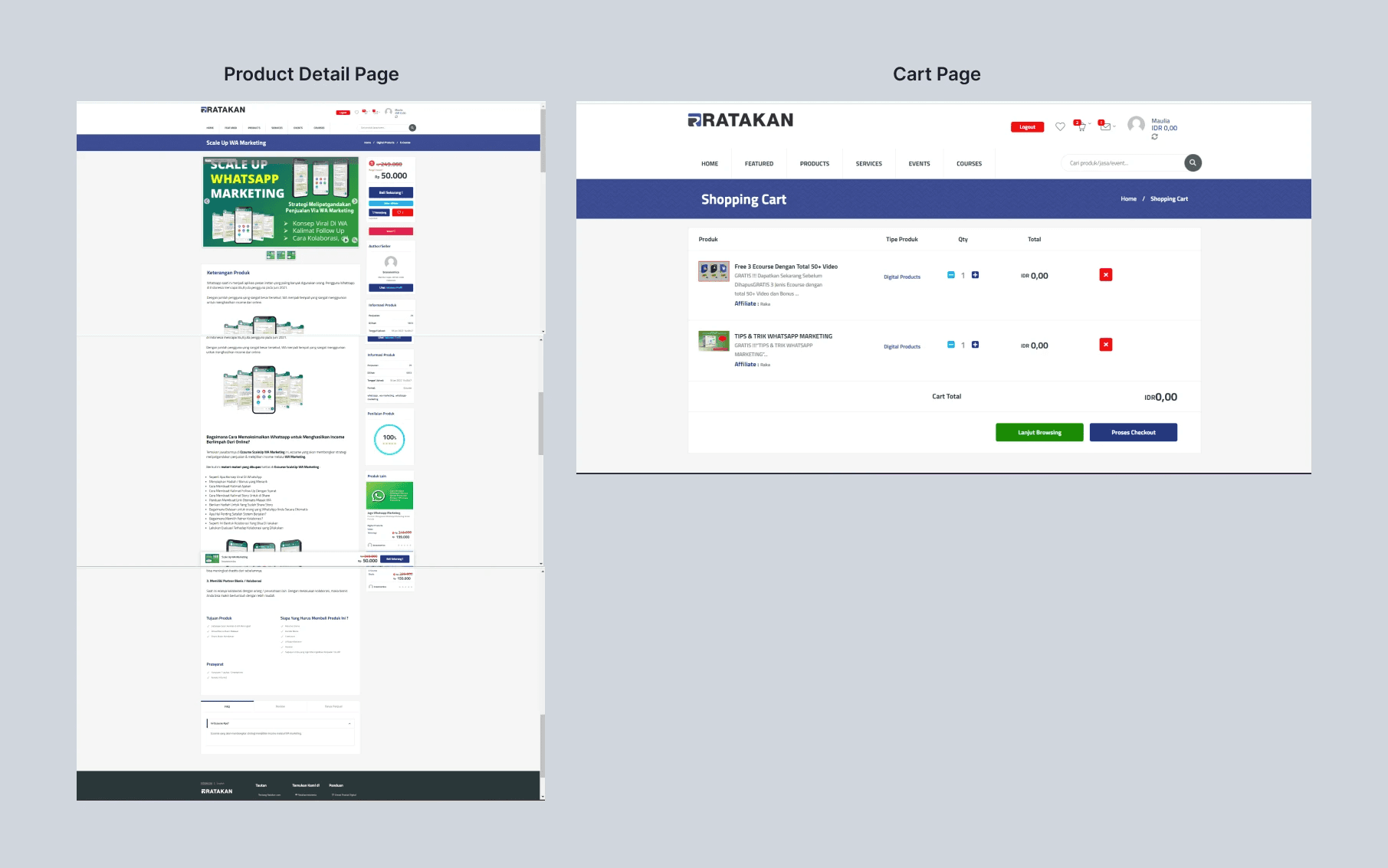
Before

Before

Know the Problem

Know the Problem
  1. Most of the users feels that the interface of product detail page also cart page made his/her feels confuse to do some action
  2. According to my mentor said that outdated interface was made conversation rate deeply down. Event some of user directly close tab after saw ratakan interfaces

Needs

Needs
  1. Built interface which has a clear command objective to carry out action
  2. Showcase interface that has a similar appearance to e-commerce in Indonesia in general.

Goals

Goals
  1. Build interface that shows consistency and scalability. This can help users navigate more easily
  2. Increase conversation rate by built interface that has familiarity with others e-commerce.
    this can make user adoption faster

Solution

Same ideas, different approach

Same ideas, different approach
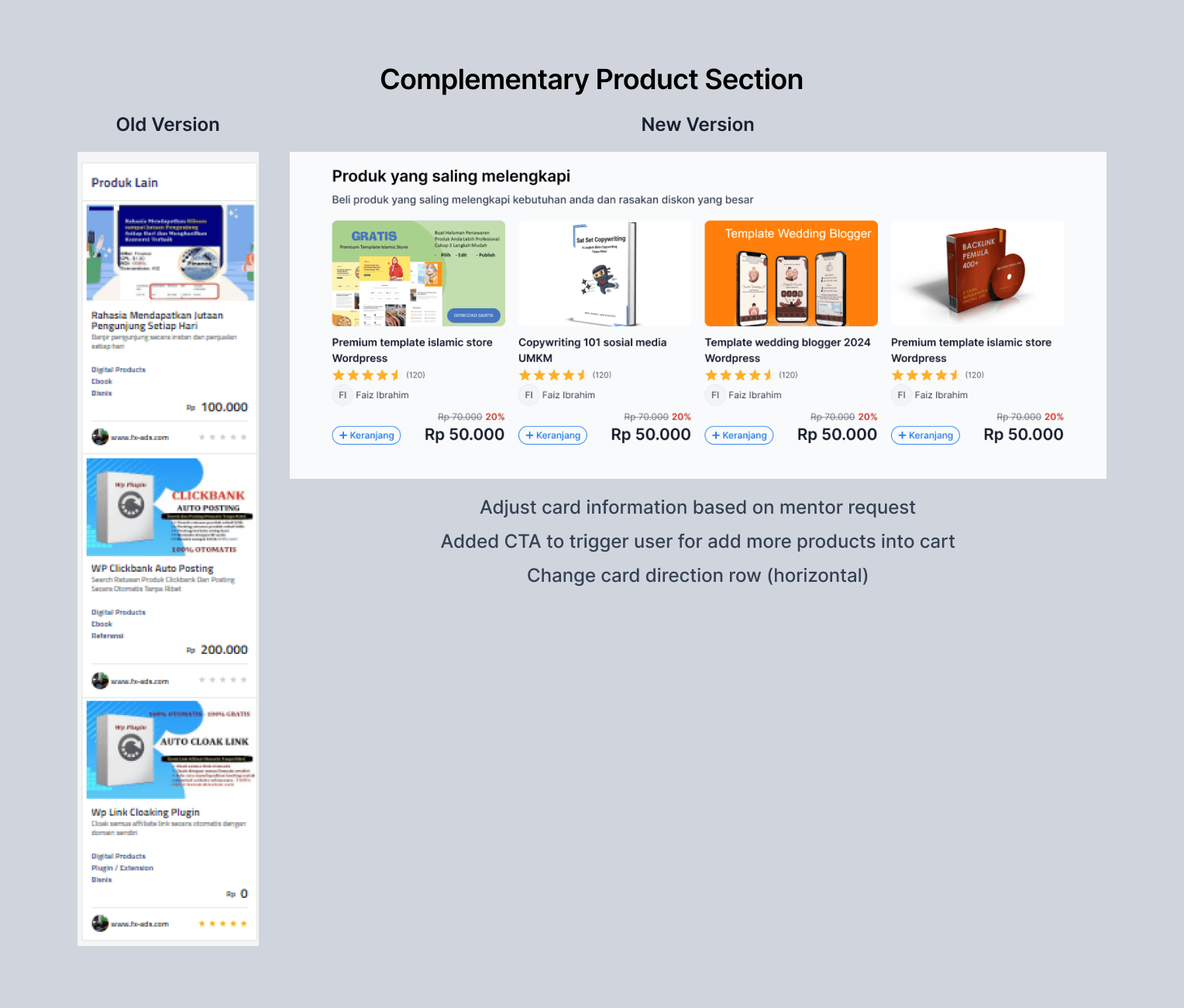
I was create 2 concept about the new version of detail product page. My mentor taught me to explore different layout to see what its best. Created more structured and consistency design compared to old version and try to shows more prominent CTA button and grouping it as same action.
Inconsistency design sometimes can lead into user had confused, also can make decrease in bounce rate. Here i recreated again the card, try to make it more clear by separate product title, ratings, seller name with prices and CTA button. Added CTA button so that it can influence users to add more products.
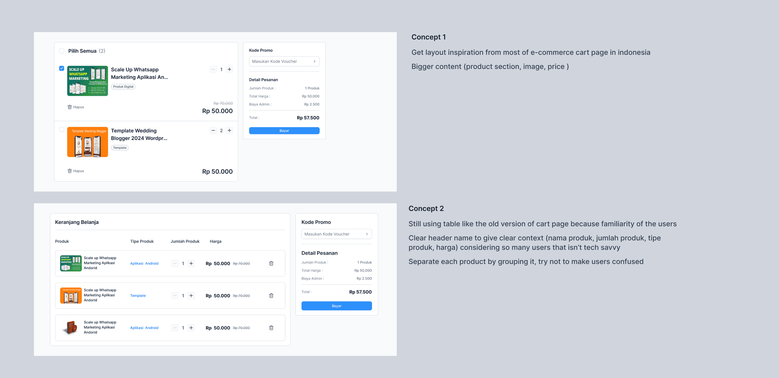
Here i created 2 concept, the first one is to make new layout by made huge card inspired by current e-commerce in indonesia, and the second one is replicate the old one, but try to made it with clear hierarchy as i decide to grouping product per product. Ended up choose concept 2 because familiarity for users.
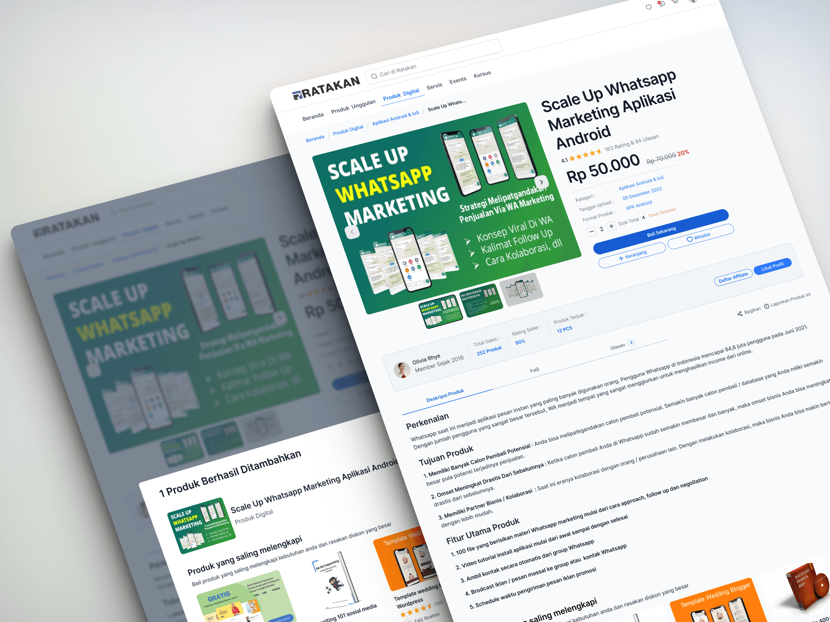
My mentor told me to product recommendation modal after users click "+ keranjang". The hope is that this can influence users to look at products from the same shop or similar products in other shops

Final Flow

My mentor told me to product recommendation modal after users click "+ keranjang". The hope is that this can influence users to look at products from the same shop or similar products in other shops
Reflection and Takeaways

Go Deep for Exploration

Go Deep for Exploration
When having many option it can help us to decide which component or layout is the best and fit into the problem, Dont trust your first design, always try to create more and asking your mentor or your team mates for feedback.

Communication is Key

Communication is Key
Even though we use technology to solve problems through design, it's important to remember that we're working with people. This means we need to be able to understand information clearly and express ourselves clearly and confidently