Back

Simplifying Teams Section for Empower
Simplifying Teams Section for Empower
UI/UX Designer
4 Weeks
Dashboard Design
Intro
Intro
Overview
This is one of my freelance project that i got referal from one my friend. Empower says to me that they need MVP HRIS Web App for their internal office. They already have some rough idea about the Web App itself. Here i only work alongside with product manager
This is one of my freelance project that i got referal from one my friend. Empower says to me that they need MVP HRIS Web App for their internal office. They already have some rough idea about the Web App itself. Here i only work alongside with product manager
Approach
mainly focus on brainstorming and exploring layouts to develop ideas and generate the best options. I build different elements and piece them together one by one, refining the design as I progress. This iterative process allows me to explore various possibilities and create visually appealing and user-friendly interfaces
mainly focus on brainstorming and exploring layouts to develop ideas and generate the best options. I build different elements and piece them together one by one, refining the design as I progress. This iterative process allows me to explore various possibilities and create visually appealing and user-friendly interfaces
Design Scope
Design Scope
When talking about designing HRIS Web App, its is quite big and complicated. Usually in HRIS there are payroll, job recruit, performance and others, but here in empower dashboard are less than common HRIS features. I only designing for Teams section and i hope that you can understand it
When talking about designing HRIS Web App, its is quite big and complicated. Usually in HRIS there are payroll, job recruit, performance and others, but here in empower dashboard are less than common HRIS features. I only designing for Teams section and i hope that you can understand it
Jump into problem
I do meeting with the clients and knowing that they're still do tracking employee data manually. With the increasing number of employees, it becomes quite difficult for HR to collect and control data from each employee.
I do meeting with the clients and knowing that they're still do tracking employee data manually. With the increasing number of employees, it becomes quite difficult for HR to collect and control data from each employee.
I do meeting with the clients and knowing that they're still do tracking employee data manually. With the increasing number of employees, it becomes quite difficult for HR to collect and control data from each employee.
I do meeting with the clients and knowing that they're still do tracking employee data manually. With the increasing number of employees, it becomes quite difficult for HR to collect and control data from each employee.
Breakdown the needs
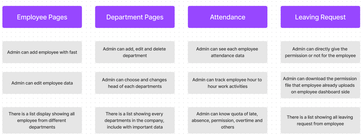
As i said before that the client already have rough idea what they need, i do meeting with client to listening and trying to understand it. For each pages, they told me what they want it and at that i also have already rough ide about the design. But before go into design, here i'll try to breakdown brief from the client
As i said before that the client already have rough idea what they need, i do meeting with client to listening and trying to understand it. For each pages, they told me what they want it and at that i also have already rough ide about the design. But before go into design, here i'll try to breakdown brief from the client
Designing Solution
Designing Solution
For employee section
As i said before that the client already have rough idea what they need, i do meeting with client to listening and trying to understand it. For each pages, they told me what they want it and at that i also have already rough ide about the design. But before go into design, here i'll try to breakdown brief from the client
As i said before that the client already have rough idea what they need, i do meeting with client to listening and trying to understand it. For each pages, they told me what they want it and at that i also have already rough ide about the design. But before go into design, here i'll try to breakdown brief from the client


Make it Fast
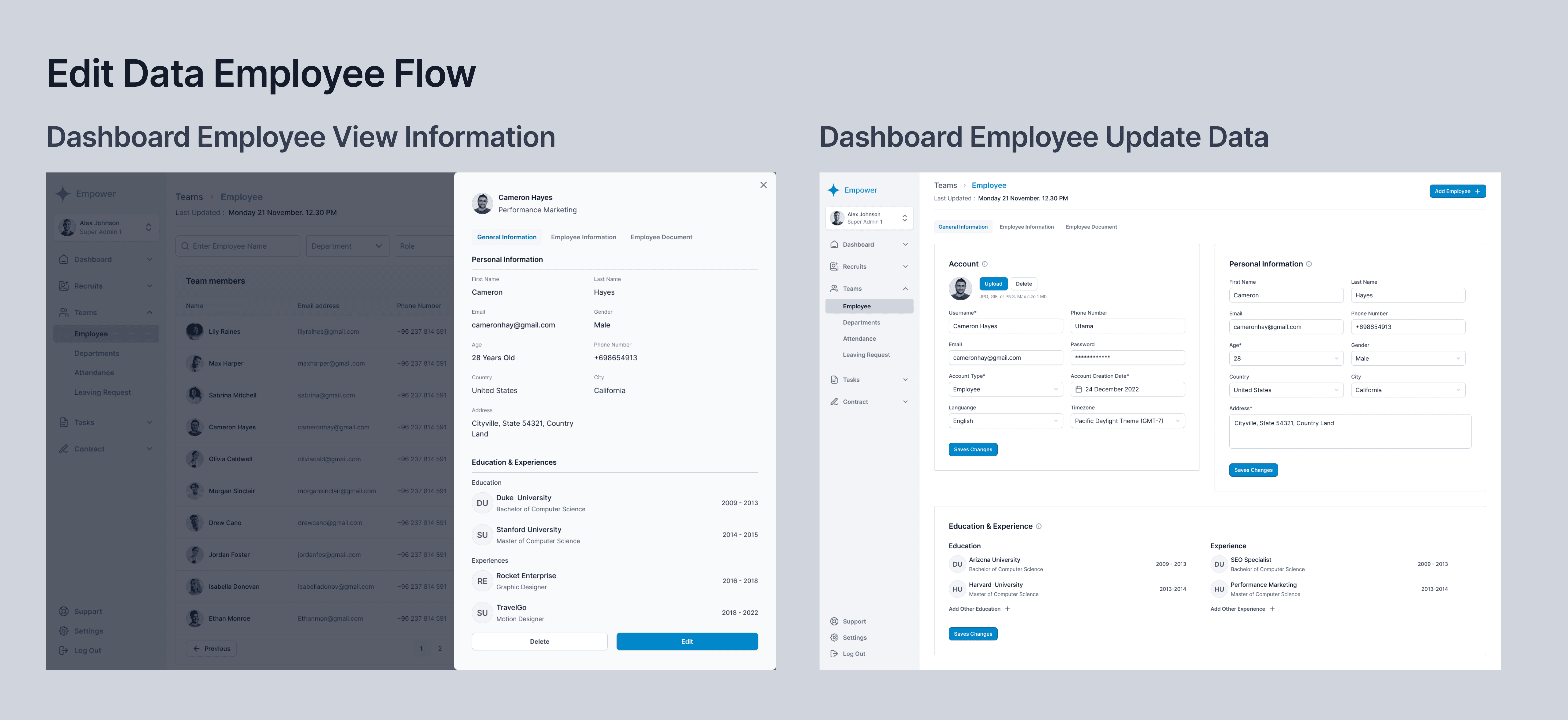
Administrators only need to input data that matches what is displayed in the drawer. This process is quicker and more effective. If you look at my modal exploration below, you'll notice there's a stepper where administrators have to fill in all the available data
Administrators only need to input data that matches what is displayed in the drawer. This process is quicker and more effective. If you look at my modal exploration below, you'll notice there's a stepper where administrators have to fill in all the available data

Component Design Exploration
Component Design Exploration
I've chosen to implement drawers for both adding and viewing employee data. I opted not to use a modal for adding employees due to its multi-step nature, which can be overly complex. The goal is to simplify the process. If administrators need to add more details later, they can easily edit the information. For viewing employee data, I've also utilized drawers as they allow for the display of a significant amount of information. As a designer, I consistently explore different design components to generate ideas and select the best options for an optimal user experience
I've chosen to implement drawers for both adding and viewing employee data. I opted not to use a modal for adding employees due to its multi-step nature, which can be overly complex. The goal is to simplify the process. If administrators need to add more details later, they can easily edit the information. For viewing employee data, I've also utilized drawers as they allow for the display of a significant amount of information. As a designer, I consistently explore different design components to generate ideas and select the best options for an optimal user experience

For Departments section
For Departments section
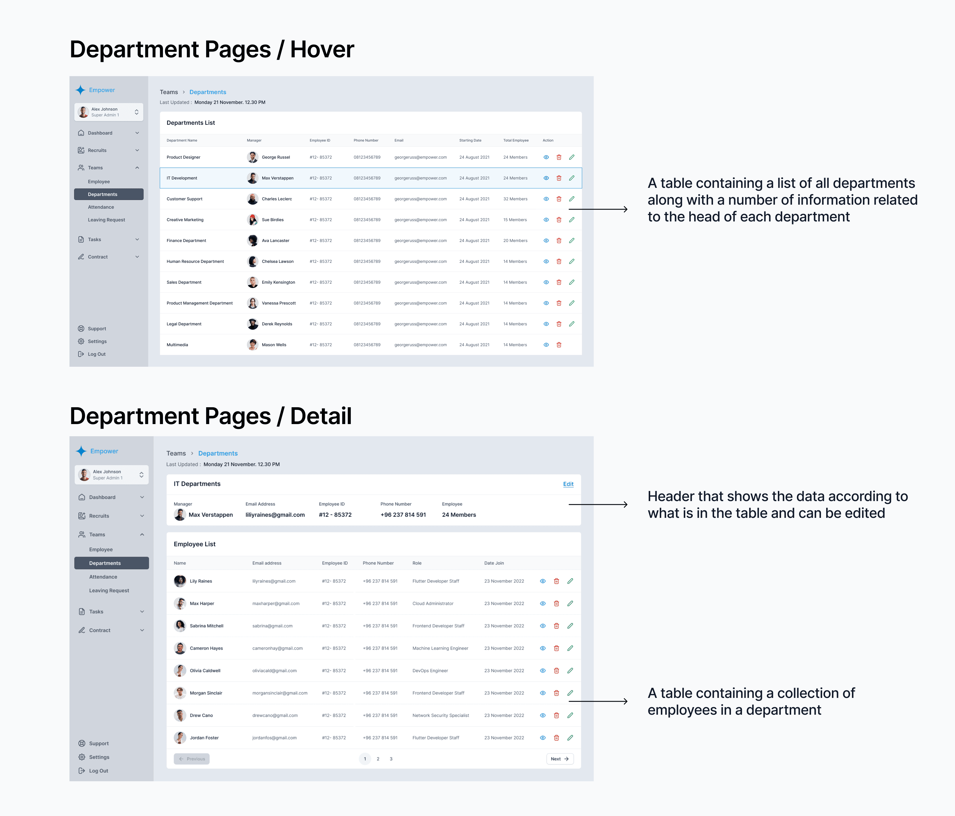
There weren't too many problems encountered when building the interface. the only challenge is in the layout between the header and the table. I decided to separate the department and table information headers in order to create a clear information hierarchy for admins
There weren't too many problems encountered when building the interface. the only challenge is in the layout between the header and the table. I decided to separate the department and table information headers in order to create a clear information hierarchy for admins
For Attendances section
For Attendances section
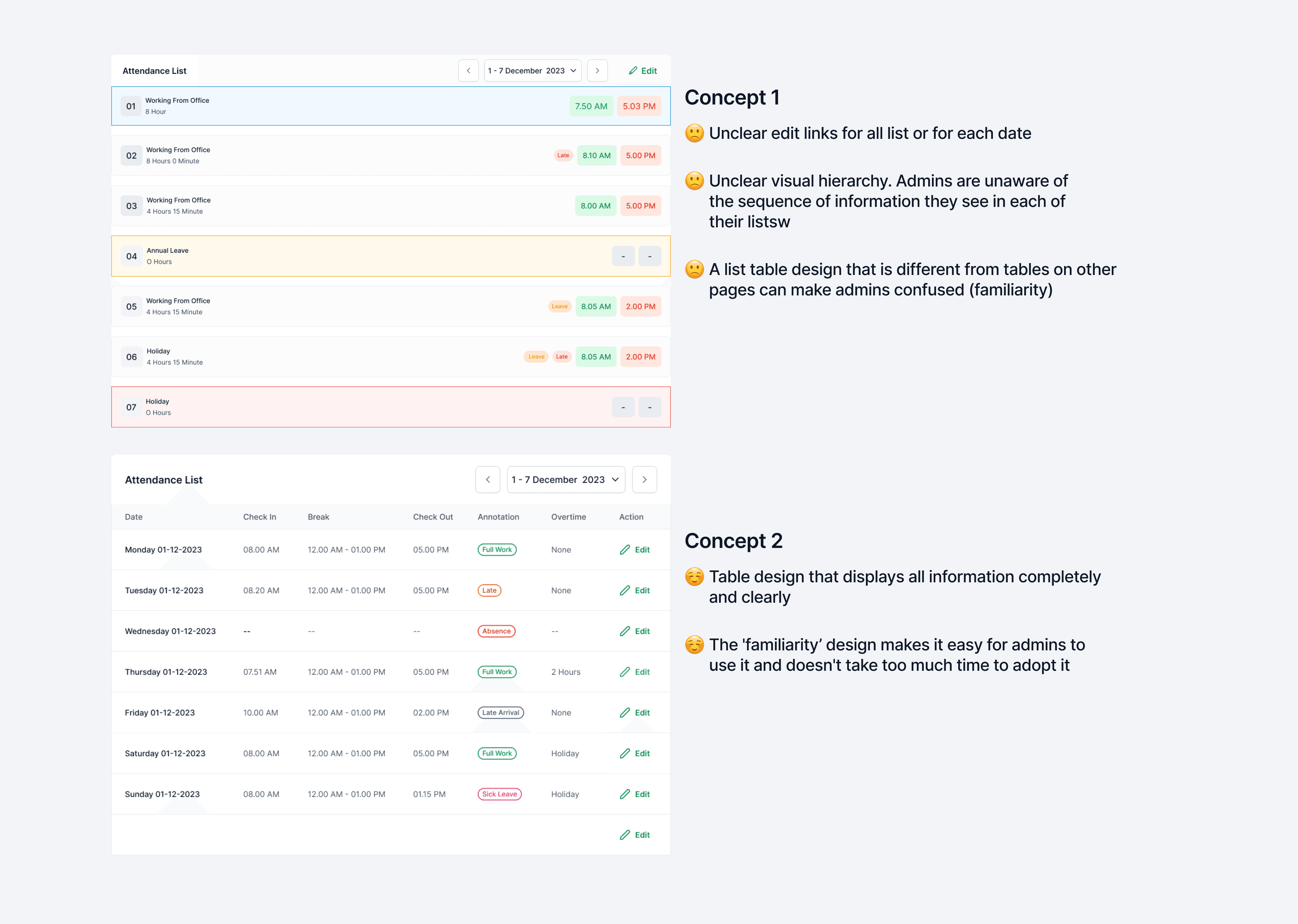
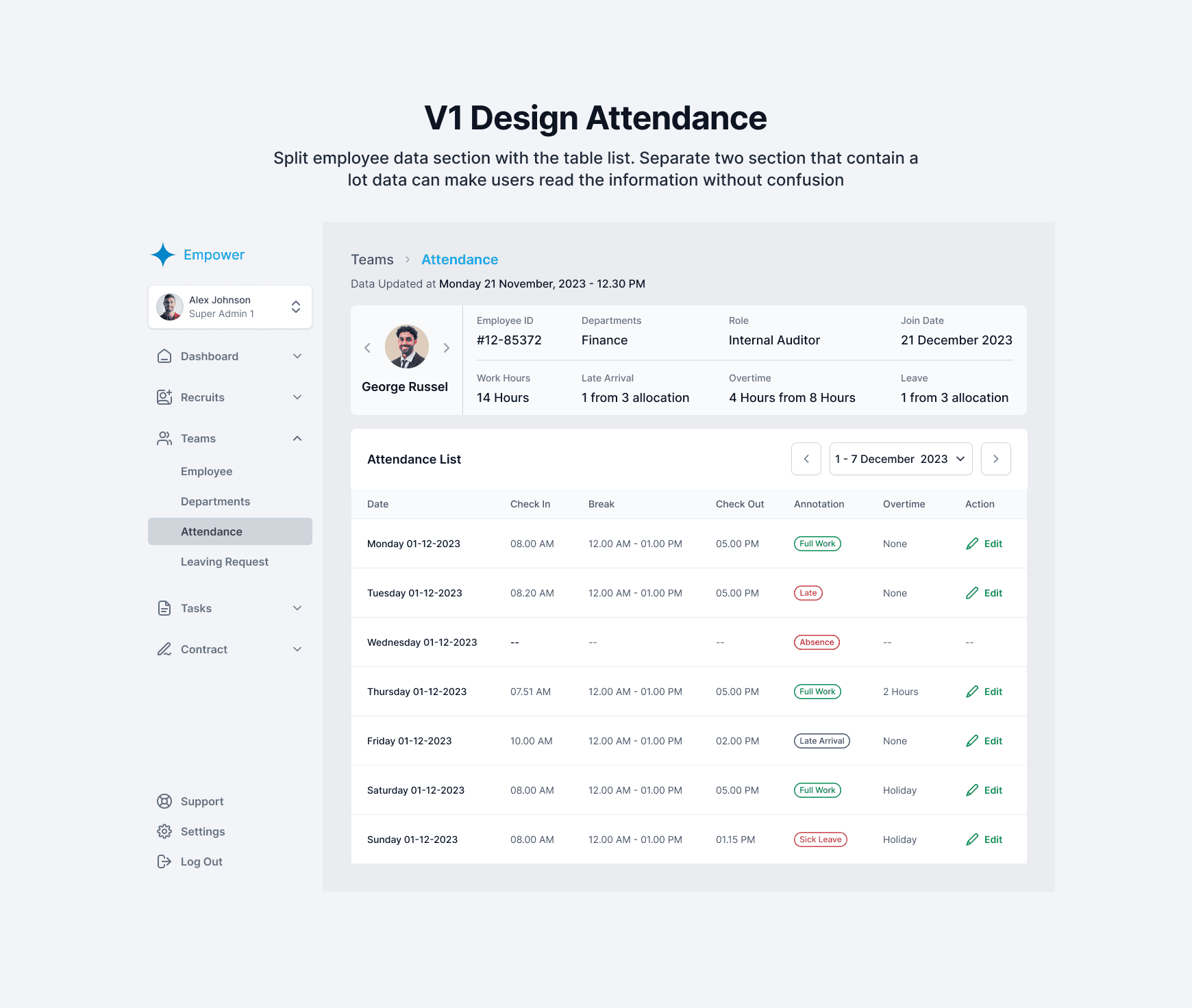
Explore table components with two different layouts. ended up with the 2nd concept because the same table design is used in other sections and for admins it will be quite easy to read the information which is quite familiar
Explore table components with two different layouts. ended up with the 2nd concept because the same table design is used in other sections and for admins it will be quite easy to read the information which is quite familiar
For Leaving Request section
For Leaving Request section
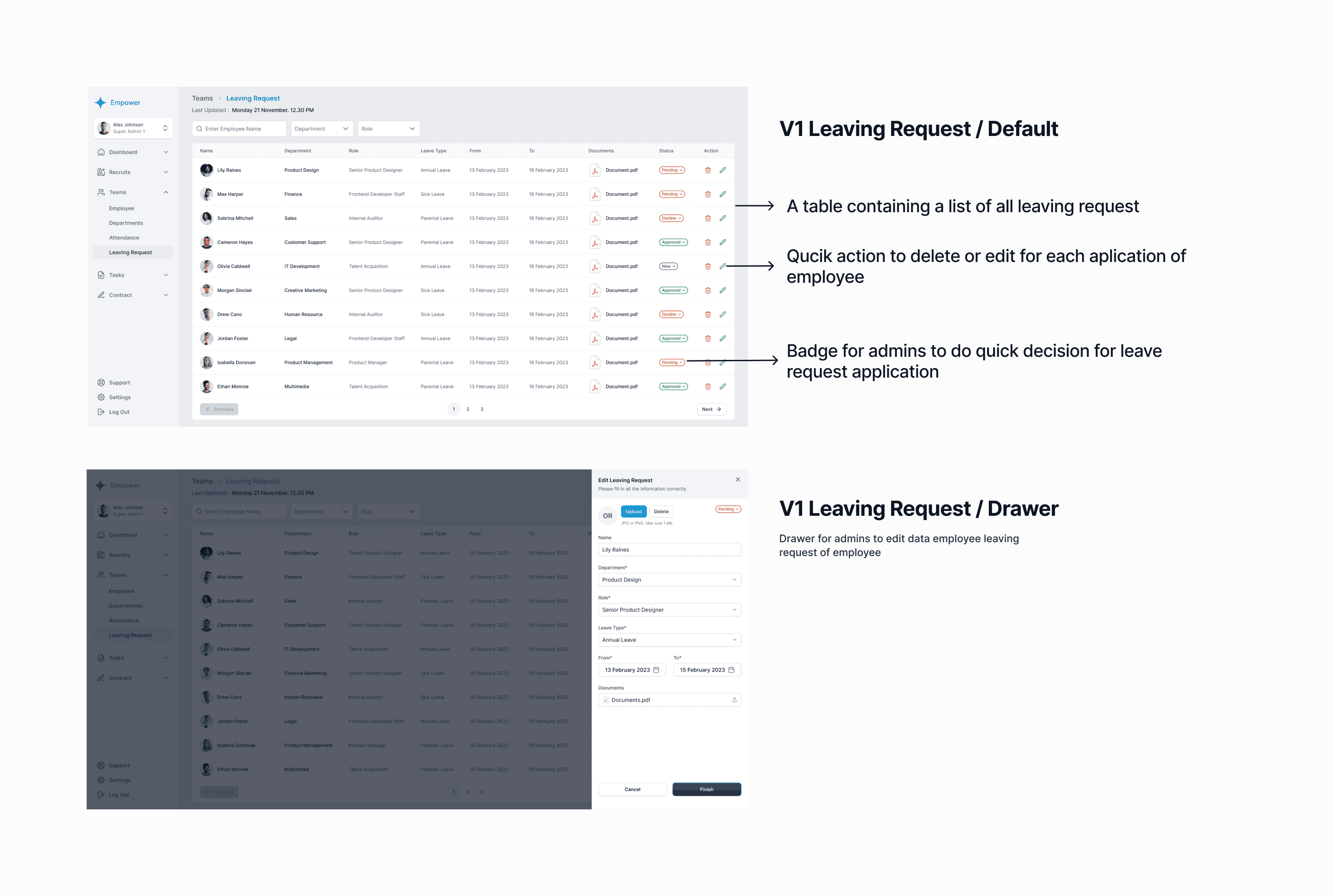
Explore table components with two different layouts. ended up with the 2nd concept because the same table design is used in other sections and for admins it will be quite easy to read the information which is quite familiar
Explore table components with two different layouts. ended up with the 2nd concept because the same table design is used in other sections and for admins it will be quite easy to read the information which is quite familiar
Design Iterate
Design Iterate
Design Itenary
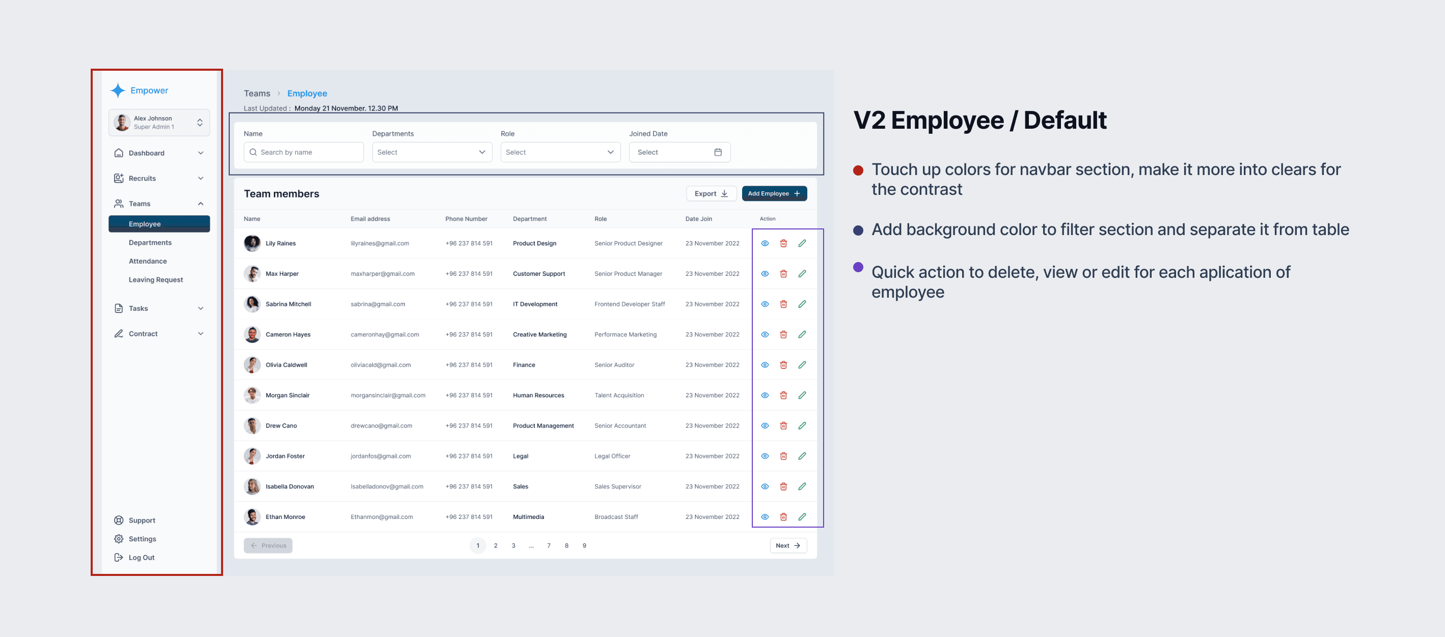
After doing internal testing and received some revision, here's what i summarized from revision that i got :
1. According to admins who isn’t tech savvy and are already 'old', the contrast feels a little disturbing especially in the main content
2.Didn't know that the action section dropdown can do delete, view or edit.
3.The data information displayed is quite good, but it is still not clear when viewed from top to bottom
After doing internal testing and received some revision, here's what i summarized from revision that i got :
1. According to admins who isn’t tech savvy and are already 'old', the contrast feels a little disturbing especially in the main content
2.Didn't know that the action section dropdown can do delete, view or edit.
3.The data information displayed is quite good, but it is still not clear when viewed from top to bottom

Final Design & Lesson Learned
Final Design & Lesson Learned
Creating design for internal tools need deep understanding about priorities. There's so many data that need to showed means there has many design exploration starting from the component and for the layout. Stay adaptive and try to generate 2-3 option. I enjoying the time when i created exploration and try to balance it with user needs.
As i look back from the beginning of the project, i learn so much things from understanding problem, communicate with client, do design exploration, and many more. Creating internal tools like this is not always about fancy design, but to make it easy for them to use it.


